Deconstructing Dieter Rams’ ten principles for good design — part 1
If you’re reading this article you’re almost certainly very familiar with Dieter Rams, his work and his influence on design. In the last year Rams has received even more attention than usual after Gary Hustwit released his documentary, Rams (2018), profiling the famous designer. Rams has long been elevated to the status of design legend, and the recent documentary has solidified and spread this status wider than ever before. His work and thinking seems to be left unquestioned in any critical way, and considering his ten principles are still widely taught in design curricula I believe this is an oversight.
To quote from another designer, Darius Ou:
If we always follow the rules set by designers who lived in the 20th century — but we live in the 21st century — then what are we following? Are we blindly following?
While I admire many aspects of the products Ram worked on, I find his Ten principles for good design problematic. On first reading his principles it’s easy to find them as inspiring as some of his most iconic designs. But when we dig deeper we see they are not without exceptions, confusion and contradiction. It’s only when we unearth these tensions in the work and thinking of those that we admire, that we begin to clarify and expand our own thinking.
This is the first in a three part series covering principles 1–3.
1. Good design is innovative
The possibilities for innovation are not, by any means, exhausted. Technological development is always offering new opportunities for innovative design. But innovative design always develops in tandem with innovative technology, and can never be an end in itself.
Looking at this principle, I find the implication that good design must be tied to technological innovation to be an extremely narrow understanding of good design.
But first let us define ‘innovative’. Here’s a simple definition from the Oxford Dictionary:
Introducing or using new ideas, ways of doing something, etc.
Eg, There will be a prize for the most innovative design.
From this simple definition it is clear good design is not necessarily innovative. Often we specifically do not want to introduce new ideas or ways of doing something. Let us imagine we are working on the design of a signage system for a large building. It is not necessary to introduce new ideas or ways of doing this in order to achieve a well-designed outcome. Good design in this context is often not innovative: it follows tried and tested practices and principles, which we know work when creating a signage system.
If we look at the phrase ‘innovative design’ the picture becomes even more confusing. Let me pull some quotes from various designers and thinkers interviewed on the subject of innovative design.
“It exposes the intrinsic power of technology… And ultimately, good design should make life more beautiful.”
“Elegant, sleek, beautiful, do not have anything to do with innovation.”
“… you cannot fathom how you once lived without it.”
“… by its very nature it should surprise us.”
“Innovative design is risky, so not everyone can be an innovator.”
“It’s quite simple. Did the design move the world?
Trying to define ‘innovative design’ is highly subjective, as we see from the range of opinions above. However, from the snippets above and our dictionary definition of innovation we could say that innovative design is not only something new, but also marked as extraordinary by its excellence that separates it out as quite clearly different.
Let’s return to the example of signage design. If I were to commission a design agency to work on a signage system, I would probably not ask them for ‘innovative design’. That’s not to say I do not want good design, I just don’t want something that has to change the world, take a risk or expose the ‘intrinsic power of technology’.
When signage is designed well it rarely stands out. It is almost always not noticed in and of itself, but is only perceived indirectly through the message it conveys. It is unlikely you will ever hear someone exclaim what an incredible signage system they’ve just seen (unless they’re a signage designer).
That’s not to say that signage design can never be innovative. Environments change and our understanding of human perception advances, which creates the need for innovative breakthroughs in order to solve new design challenges. For example, the work of Margaret Calvert and Jock Kinneir on the road sign system in the UK during the 1950s could be argued as an example of innovative signage design. Their success and innovation didn’t rely on technological advances, but on the new methodologies and practices they introduced to the process of designing a road sign system.

I believe you could make a strong case that good design is mostly not innovative. It never even tries to be innovative. It is simply good design, which we understand as the skilful and solid application of known practices. Good design doesn’t need technological advances, to change the world or stand out as strikingly beautiful. And it probably won’t leave you wondering how you lived without it. Good design is often not noticed at all, precisely because it is good design.
The problem with Rams’ first principle is that he has confused and collapsed two things into one: good design and innovative design are not the the same thing, and one does not necessarily follow the other.
2. Good design makes a product useful
A product is bought to be used. It has to satisfy certain criteria, not only functional, but also psychological and aesthetic. Good design emphasises the usefulness of a product whilst disregarding anything that could possibly detract from it.
The most immediate issue that occurs to me with this principle is the focus on ‘product’, and highlights an issue for all Rams’ principles. Good design is not always put to the service of products. Rams is famous for, and spent most of his career, as a product designer of consumer goods. As such, his principles should be understood within his field of experience and we should be wary of extrapolating them as universal principles that will cross all fields of the vastly varied landscape of design.
Putting this issue aside, this seemingly straightforward principle is not without its exceptions. Take the Australian agency, for example, who were commissioned in 2016 to design the ugliest cigarette packet possible. Arguably the only usefulness of smoking is to achieve a certain appearance seen to be attractive in some way (anything further to this benefit is due to the physical and psychological addiction that follows). The objective in this product design was to make the packet so unappealing it would not be deemed in any way useful to the consumer as a desirable accessory.

If we look beyond product design, the principle also encounters issues when we consider the notion of ‘usefulness’. If we take high-end fashion design seen on the catwalk, it’s clear the clothes are not designed to be used within our normal understanding of the functional usefulness of clothes. They are designed to make a statement, and exaggerate the ideas behind the designs in such a way that they may find themselves in a diluted, partial or more practical form within next season’s high street fashion. The objective may also be to simply gain attention for a designer or brand and express creative flair.
It could then be said that the usefulness in this type of high-end fashion is concentrated on the ‘psychological and the aesthetic’. We could then clarify Rams’ principle so that usefulness is defined as either functional, aesthetic or a combination.
But the problems continue when we consider digital design. The principle presumes we will know beforehand exactly how the outcome of our design will be used. When we design a toaster or a radio we know what its intended use is, but in other design contexts it may be limiting to try and conceive of a specific intended use. For example, in the design of digital products we may design in a way that allows for a number different uses and acknowledge there may be a number of totally unexpected uses as well as those intended. We may then observe the most common uses and take those findings to hone the product in that particular direction. In the digital space the relationship between designer and user is more symbiotic, where the direction and usefulness of a product is in flux and determined in a continuous feedback loop between creator and user.
Within the digital context we must also think about more nuanced problems concerning a product’s use. Are social media products useful? In what contexts and at what times? And do they have a limit where overuse undermines their usefulness to the point where they may even be harmful? These considerations may lead to designing a product so that it does detract from its intended use in certain situations and under certain conditions that would have a negative long-term effect.
3. Good design is aesthetic
The aesthetic quality of a product is integral to its usefulness because products we use every day affect our person and our well-being. But only well-executed objects can be beautiful.
Let’s start again with a simple definition from the Oxford Dictionary of ‘aesthetic’, so we can frame our questions with this term clear in our minds.
Concerned with beauty or the appreciation of beauty.
Eg, The pictures give great aesthetic pleasure.
When we talk of aesthetics we open a philosophical can of worms and we must immediately question whether it’s even possible to agree an objective measure or definition of beauty. But even without entering this debate we can see that the purpose of good design is often not concerned with beauty; in the sense that someone perceiving the result of a design would be compelled to appreciate its beauty.
Let’s consider typography, the discipline of arranging and organising type. Sometimes referred to as the ‘invisible art’, it is a design practice whose primary concern is to clearly convey the content and meaning of the type, so that it’s easy to read. The objective is not for the reader to appreciate the beauty of the typography. Other designers may appreciate the beauty in typography, but outside of our profession it is rare that the typography in a book or on a website would ever be consciously noted or appreciated.
If we look at type design, the art of designing a font or typeface, we also butt up against issues with this principle. While certain fonts may be designed with aesthetics front and centre in the design process, the every day typefaces that we see across content online and in print are mainly concerned with the legibility of individual characters and the readability of the type across words and sentences. It could be argued that this results in a beautiful type design, but even within the type design community there is no agreement on aesthetics. I’m reminded of another of Hustwit’s documentaries, Helvetica, which while being largely an ode to Helvetica’s beauty, also includes an interview with the famous type designer Erik Spiekermann, who can barely contain his hatred for Helvetica.
Regardless of debates on aesthetics and beauty, it is clear that the aesthetic quality of a design is not integral to its usefulness. Love it or hate it, Helvetica is highly legible and readable, and as such is incredibly useful for many different uses. Its utility derives in large part precisely because most people do not even consider its beauty (or lack of) — they simply read the words and are left to focus on the meaning of their message.

Beyond typography and type design, we could also look at the design of objects where an aesthetic quality would not be desired or even consciously rejected. The design of products that contain dangerous substances or medicines where the sober display of information in an object that is securely designed is the main objective. We could also look to our Australian cigarette packaging for a more off-beat example.
If we look to graphic design we can see the response to the minimalist aesthetic ideals of Rams and others of his era through the New Ugly or Graphic Brutalism movement. The objective here is to blend jarring styles, to break established ‘rules’ of design, in order to evoke a response and get people to engage with the work in a way the ubiquitous clean and minimal design we are accustomed to never would. The maximalist approach of more is more is gaining recognition, as it is championed by young designers who are embracing new digital technologies and are more acutely tuned to what stands out in the digital context.
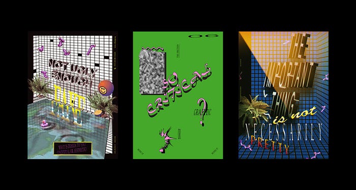
The type of minimalist design approach Rams advocates is a very western, 20th-century approach to design. To some designers Rams’ products are sleek, elegant, beautiful; but to others they may appear bland and forgettable. What ‘affects our person and well-being’ aesthetically is deeply subjective and formed in large part on social and cultural factors. It’s no coincidence that as the design community has become globalised, younger voices from all over the world are shifting and challenging the established order. Different cultural ideas, visual languages and design traditions are mixing, and in these clashes we see clearly how ideas of aesthetic design are often cultural and trend based.
Et voilà! I hope you enjoyed the article.
Check out part two, covering principles 4–7.
I’m a co-founder at Akord
And you can follow me on Twitter @_pas_cal

